|
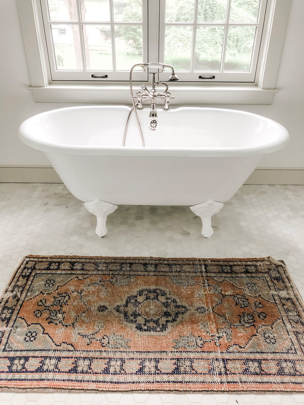
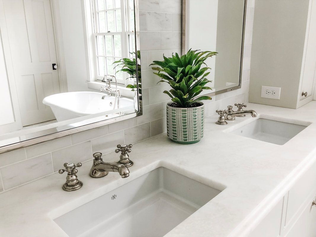
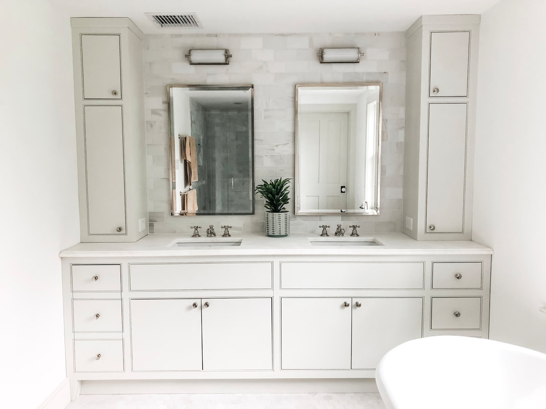
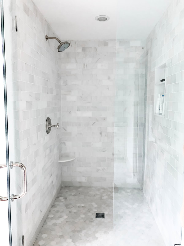
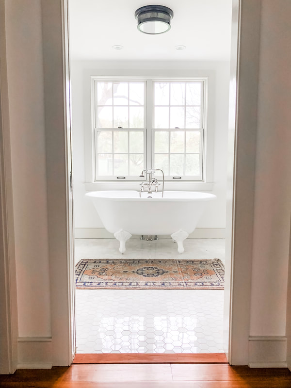
When it came time to discuss the design of the master bathroom, I had one requirement: I desperately wanted a vintage clawfoot tub. In all my previous bathrooms I never had a tub, let alone a vintage clawfoot tub. While this may seem like a simple request, there was a lot of back and forth between my husband and I, our interior designer, and our contractor over that one piece. For quite awhile we were not sure that the tub would fit in the layout of the bathroom. We did not want the tub to encroach on the vanity too much, and my husband and I wanted it to make sense in the space. You wouldn't believe how many times my husband was in the space with our measuring tape hemming and hawing over this decision. While it's position in the bathroom is a bit close to one of the vanity sinks, I'm so thankful we decided to go for it and include it in the layout of the bathroom. I love how serene it appears situated beneath the bank of windows. Full disclosure: there is a huge pile of my children's bath toys currently in that tub at the time of this picture. My son loves to use the hand-held faucet and only OCCASIONALLY gets way too much water onto the floor. While my children use this tub more than I do at present, I dream of the day when I can more frequently use this tub as a space to find peace and relaxation. Situated just in front of the tub is a beautiful vintage rug that our interior designer, Kelly Robson of High Street Market, chose for us from her store. If you are a lover of vintage rugs, I would highly encourage you to head on over to her shop and check out her selection! They are beautiful! I love how the various shades of beige work so well with our trim color, Benjamin Moore's "November Rain." The pops of blue, green, and orange provide a nice introduction of color into the space. I love the worn feel of this piece contrasted against the more polished and pristine floor tile. Our vanity, pictured above, is located just to the left of our clawfoot tub. When designing the double vanity for the master bathroom, we again worked with Village Handcrafted Cabinetry. Village constructed all of the custom cabinetry throughout our home, and I could not recommend them more highly. Jeff and I wanted to make sure we had enough space for storage, so we decided to include the extra cabinet space situated on top of the vanity. The upper cabinets are just enough extra storage without being too large for the space. These cabinets were painted the same color as our trim, Benjamin Moore's "November Rain." We also used the same counter top as our kitchen counters (Mystery White). I love how the sinks are sunken into the stone counter top, and the vintage faucets are the perfect compliment to the clawfoot tub you get a sneak peek of through the reflection in the mirror. The faucets are polished nickel and are the "Astur" faucets from Ferguson Enterprises while the light fixtures above the mirrors are called "Calliope Short Bath Light" from Visual Comfort & Co. To see a full picture of the vanity look below. In addition to the tub, we also included a free standing shower. The tile you see pictured on the floor, backsplash and in the shower are all Carrara Marble. This was one of our "splurges" for our home to elevate the master bath a bit from the rest of the bathrooms in the house. The backsplash and shower have the subway tile shape while the floor has a small, hexagon shape. The hardware in our shower mimics the hardware used for our two faucets and continues the thread of a classic vintage touch throughout the space. I love the way it all turned out! For a look at our shower space see below for a picture. When I think of where I would like to take this space into the future, I would love to incorporate a bit more subtle pops of color through decor pieces and the addition of some window shades. If you've been following along on our renovation journey, you will notice that all of our "finished" spaces still lack any sort of window treatments. To be frank, we were so over making decisions regarding our house (and lacking the necessary funds!) that we decided to wait on any kind of window treatment. That being said, our neighbors might be getting a bit more than they bargained for if they were ever to look into our windows!! I look forward to the days when I can choose some country-cottage styled patterns to adorn these windows to help soften the space and provide some much needed privacy! But until then, I will continue to enjoy the soapy chaos of toddler bath time in the tub that inspired it all.
0 Comments
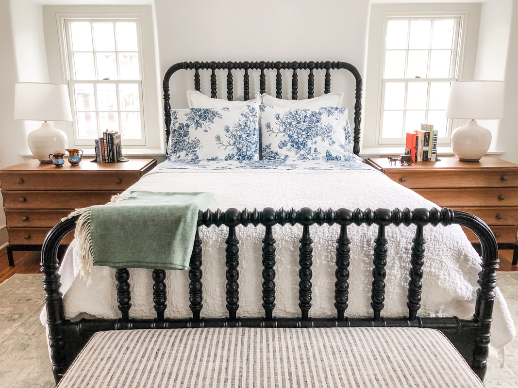
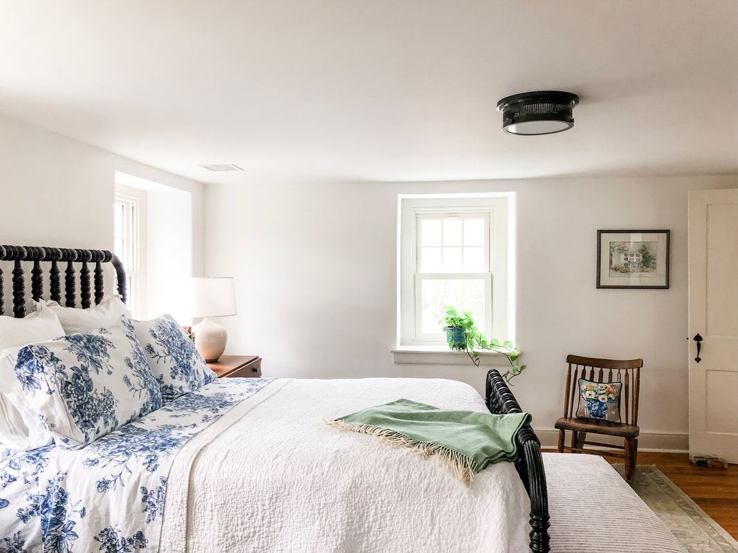
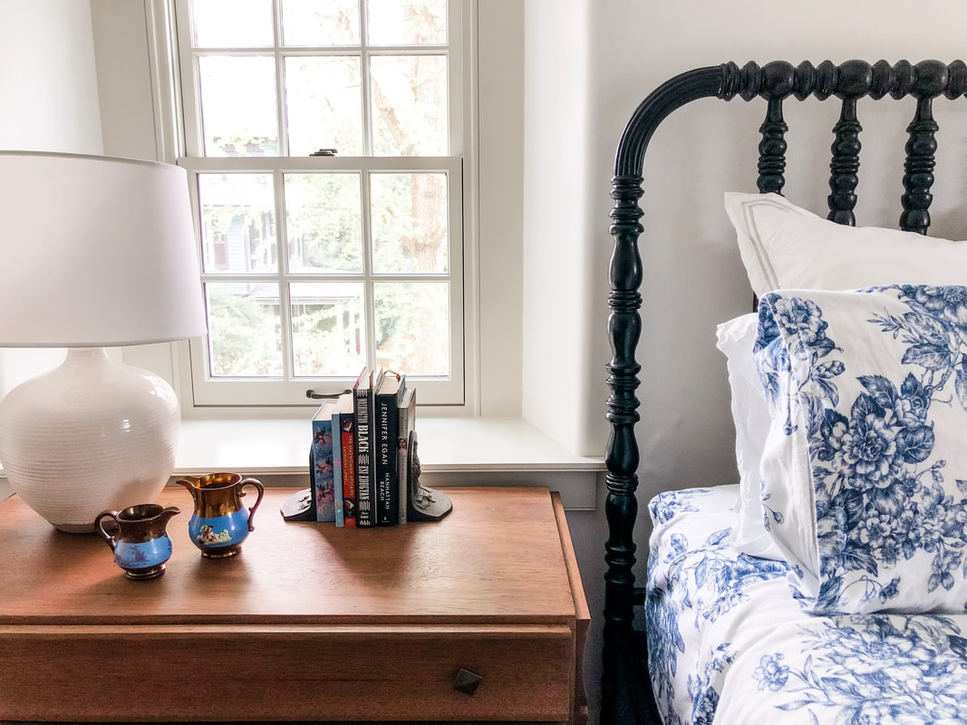
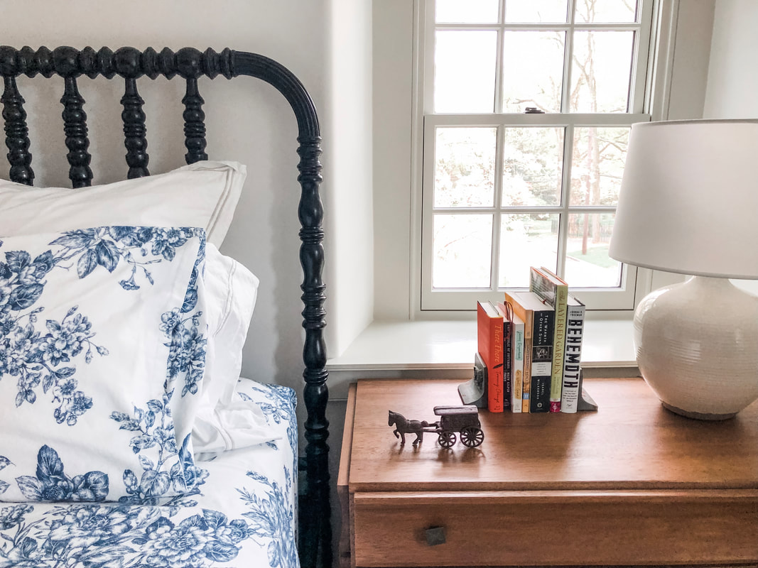
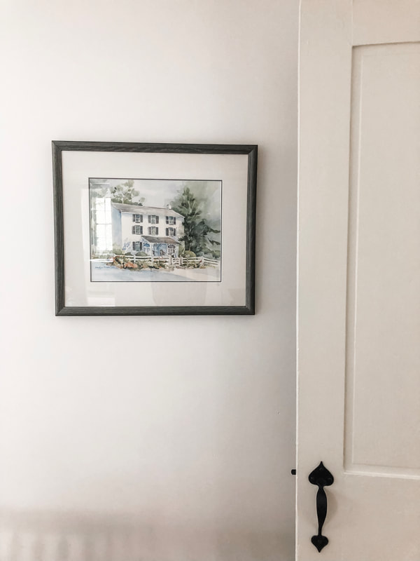
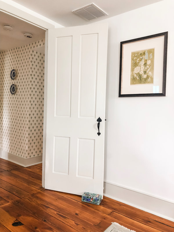
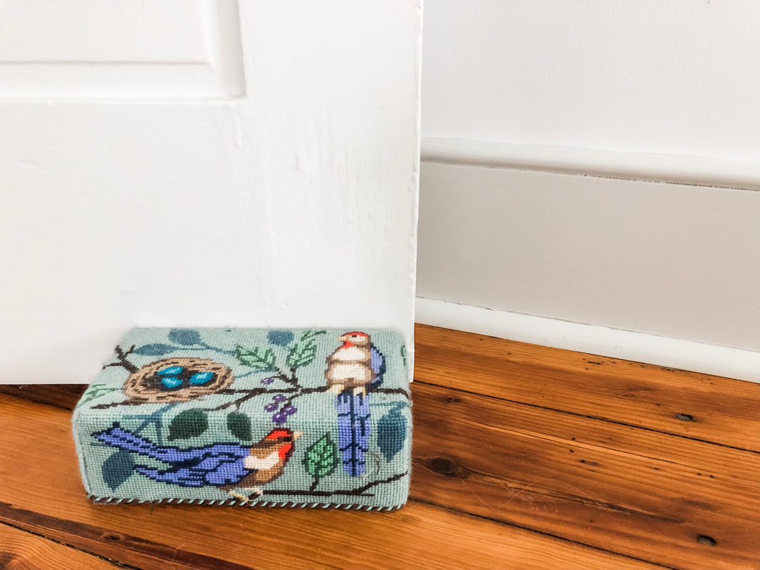
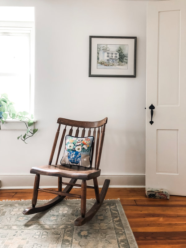
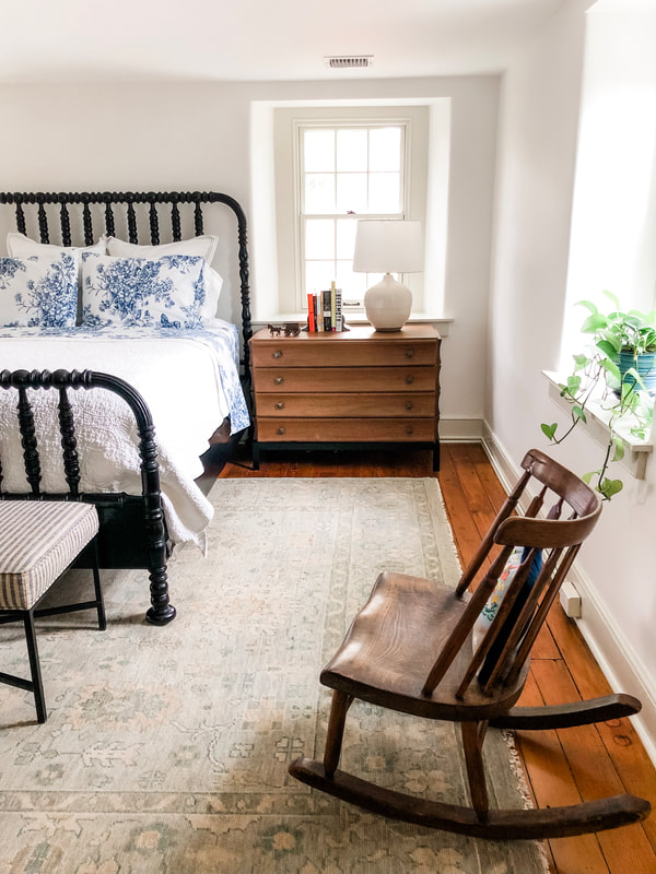
When it came time to create the feel for our master bedroom, I knew I wanted to maintain the clean, streamlined, country house aesthetic we had used in the other spaces of our home. When reflecting back on previous bedrooms, I can recall an array of bold color choices and patterns that did not stand the test of time. Throughout this process, Jeff and I always said this was the house we planned to live in for the next thirty years, so I wanted our design and decor to be something I still loved many years from now. To be honest, the inspiration for our bedroom came from a fellow mom I followed on instagram (seriously go and check out her page because I love what she has done with her historic home, and it serves as my daily inspiration when creating my own). You will notice that my bedroom shares one very important piece of furniture with the design of her own master bedroom: the bed frame. Check out the picture below: All of the rooms in my house are painted white with a subtle trim color (Benjamin Moore's November Rain). I love how the black bed frame pops against the white walls and quilt. The quilt that adorns the bed is from Pottery Barn, and I absolute love its subtle stitching. Fair Warning: It is a very light-weight quilt, but I secretly love that because it allows me to have flannel sheets when normally my husband bans those from our bed! The quilt is also machine washable which is a must! You will also notice that we added two new windows to this room (like the dining room and living room on the first floor). While adding those two windows was labor intensive, it was completely worthwhile because I love the additional natural light they provide. The two bed side tables nestled snugly beneath the new windows provide endless charm. If you are interested in sourcing the other pieces of furniture in our master bedroom, head on over to our interior designer's shop, High Street Market, as the bed side tables, bench at the foot of our bed, and table lamps all came from her store. I think our bedroom achieves a nice balance of inspiration from our interior designer coupled with a few personal decor and furniture pieces Jeff and I have inherited from our families. Look below for some pictures that highlight some of the historical and sentimental pieces we've incorporated into our master bedroom. While our bed side tables were a new purchase and not antiques, we balanced them with specific treasures that help to unite the historic with the modern. The antique luster pitchers on my bed side table belonged to Jeff's grandparents and were passed down to us from Jeff's mom. I love how the bright blue compliments the sheets we have here on our bed. The horse and buggy figurine on Jeff's bed side table celebrates the horse and carriage business that Jeff's great grandparents built and showcased at competitive horse shows in Pennsylvania. When it came time to choose pieces to adorn our walls, we began with a sentimental piece given to us from the previous homeowners. At the closing of our house, the previous owner brought with her a painting she commissioned of the home. She had this painting on her wall for the thirty years she lived in the home, and she passed it along to us as she was excited to see another young family grow and create memories in a space that had been so meaningful to her and her family. You can see from the painting that there used to be a white, split rail fence and ornamental benches on the front porch that are no longer there. I would love to bring back those features! Something else I love about the original 1874 part of the home is that we were able to restore the original doors and give them historically accurate hardware (as seen above). What's unique about the rooms in the original structure is that they each have two doors (one that opens to either side of the center staircase. The door pictured above opens to the staircase going up to the third floor and the door you see pictured below opens to the staircase going to the first floor. On the opposite wall Jeff found an original painting from an artist on instagram. I love the subtle greens, creams, and blues present in this floral painting. They perfectly compliment the white and green patterned wallpaper and blue and white plates in the hallway. My hope is to one day use this color palette as the inspiration for a quilt my mom has offered to make for us. My mom is an accomplished crafter who quilts, needlepoints, upholsters, basketweaves, and knits. She passed along a few of these trades to me, and you will see some of my own creations in our master bedroom. Below, you can see one of my creations (a needlepoint brick door stopper!). These door stoppers are a "quick" project by needlepoint standards but a fun way to bring some charm to a space. My plan is to eventually create brick door stoppers for all of the bedrooms. In addition to the door stoppers, you can see a needlepoint pillow I created on an antique rocker in our master bedroom. The rocker was another treasure passed down from Jeff's grandfather. I love its unassuming profile in our modest bedroom, and it serves as a wonderful piece to perch on as you tie your shoes in the morning. This pillow is one of my favorite needlepoint pieces. You will continue to see some of my creations throughout the house. Most noticeably you will eventually see the needlepoint stockings I created for all of us at Christmas time! I love how my mom has passed down this skill to me and now we frequently share and discuss the projects we work on to make our homes feel warm and inviting. I hope you enjoyed learning about the stories that accompany the pieces of my master bedroom and look forward to reading about the development of our master bath in the next blog post of "Mill House Musings." If you like what you see, head on over to my instagram page and see more photos documenting the renovation of our 1874 Pennsylvanian mill house.
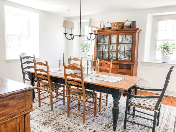
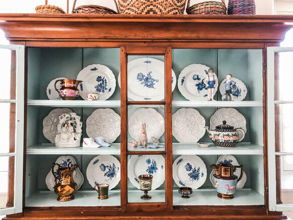
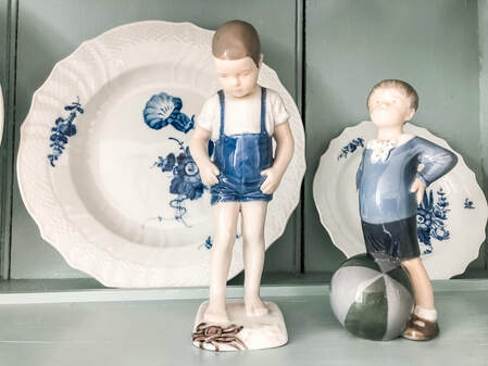
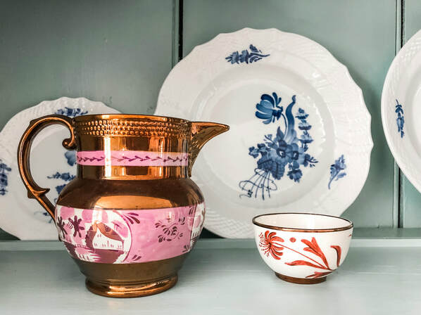
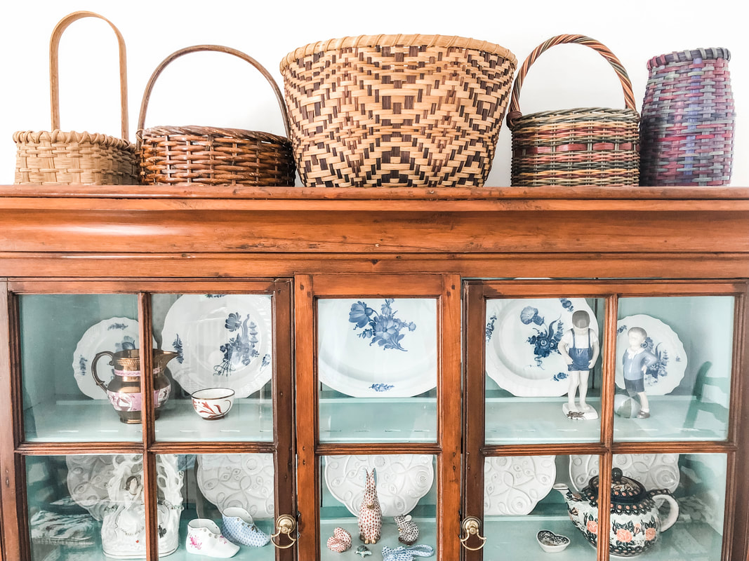
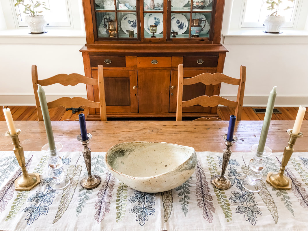
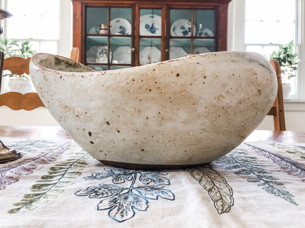
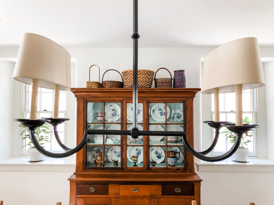
When Jeff and I were young (well, younGER) we loved to receive treasures from our families to help populate our home in a meaningful way. At the time we appreciated the pieces because we had recently bought our first house and needed help populating it with furniture as we had moved from a one bedroom apartment into a four bedroom house! As you can imagine, there were a lot of empty spaces for quite awhile! Now, in our seasoned thirties, we love those pieces of furniture and decor because they tell a story. Our dining room is a perfect example of this. Every single piece in this space was passed down to us from both our mothers. The only original pieces Jeff and I contributed to this space are the rug and our wedding china. But even that is interspersed with the china that belonged to the generations before us. Our dining room table and chairs were passed down to us from Jeff's mother. The farmhouse table looks as if it was meant to be in our 1874 Mill House, but what I love most about it are the scratches that are sprinkled on the table top. While some might wince at those imperfections, I love those worn and grooved moments because they tell the story of a family that gathered at this table and whose love is etched into each scratch. Our antique hutch, pictured here with the doors open, belonged to Jeff's grandfather and grandmother. When Jeff's mom gave us this piece after the death of Jeff's grandfather, we couldn't wait to populate it with our wedding china which had not seen the light of day since we had unwrapped it after our wedding. But prior to placing anything into the hutch, we needed to give the light blue paint on the interior a refresh. Jeff did a wonderful job matching the original color, and I love the subtle pop of blue. Our wedding china is the purely white plates featured on the middle shelf. The white dining set with blue flowers belonged to Jeff's grandparents. We loved mixing the antique dining set with our modern place settings to unite our home with the home of our departed loved ones. Mixed in with the china are unique pieces from Jeff's great grandparents and gifts from our wedding. The boy figurines were passed down from Jeff's mother while the floral tea pot was a wedding present. The luster pitcher and cups sprinkled throughout the hutch came from Jeff's great grandparents. Jeff likes to say that Luster isn't "popular" anymore but he (and I agree!) that the luster provides a striking contrast to the more simple plate designs. Situated above the hutch is a collection of handmade baskets in various sizes, shapes, and colors. Growing up my mother was an accomplished crafter. She needlepoints, knits, and makes beautiful quilts and baskets. I have picked up a few of these skills from her and love going to her with any questions or to share a new project. My mom created the large basket in the center. I remember my childhood home was always populated with my mother's creations--and she would always find a place for a beautiful basket. I love that I have many of her baskets sprinkled throughout the house because they say "home" to me and warm my heart with fond memories of my mom and the beautiful home she created for my siblings and I. I love this table runner we purchased from Terrain. The muted blues, greens, purples, and grays compliment the colors that peek out from the hutch and the faded blue chairs at the head of the table. We have a hodgepodge of candlesticks that we have inherited over the years of various colors, heights, and materials. I love mixing and matching those for different textures and effects. Speaking of texture...how amazing is this ceramic bowl we are currently using for our centerpiece?! I love the primitive nature of this bowl, and the sweeping movement created by the brim of the bowl is breathtaking. The speckled brown and the dirtied white match perfectly with the table runner underneath. Jeff purchased this from a local artist which just reminds all of us that the pieces that bring the most character and life to your homes are often the product of an individual craftsman or craftswoman! This chandelier was chosen by our interior designer, Kelly Robson of High Street Market, and I think it gives a playful twist to the traditional candle style chandelier you see in most dining rooms. I like how the shades cover both candles at once to give it a more modern and streamlined aesthetic while still being reminiscent of the traditional chandeliers we all love in historical dining rooms.
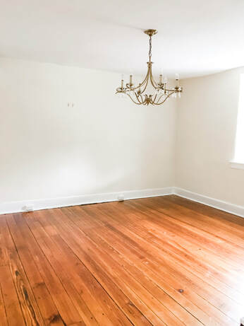
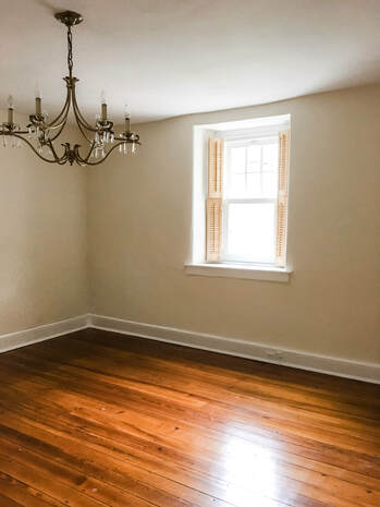
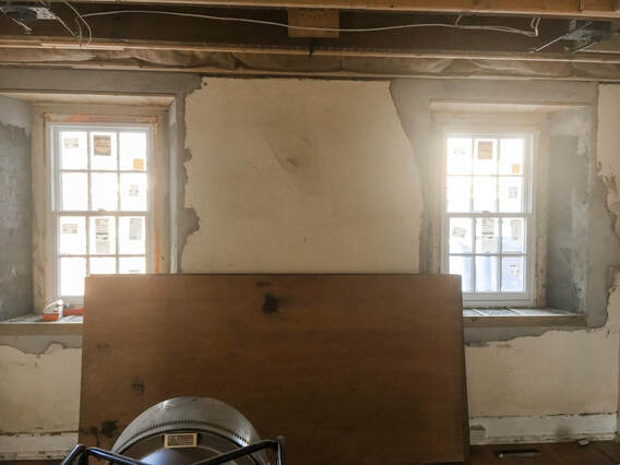
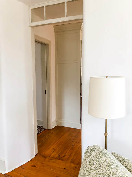
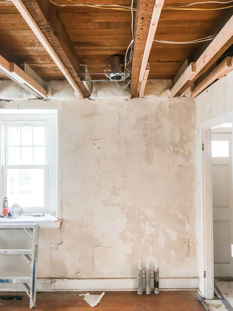
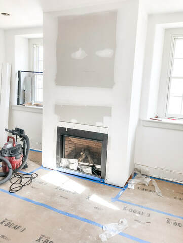
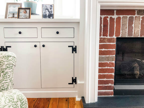
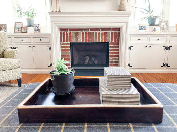
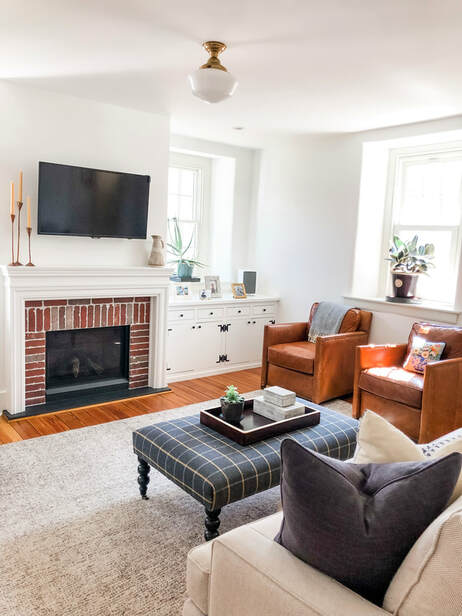
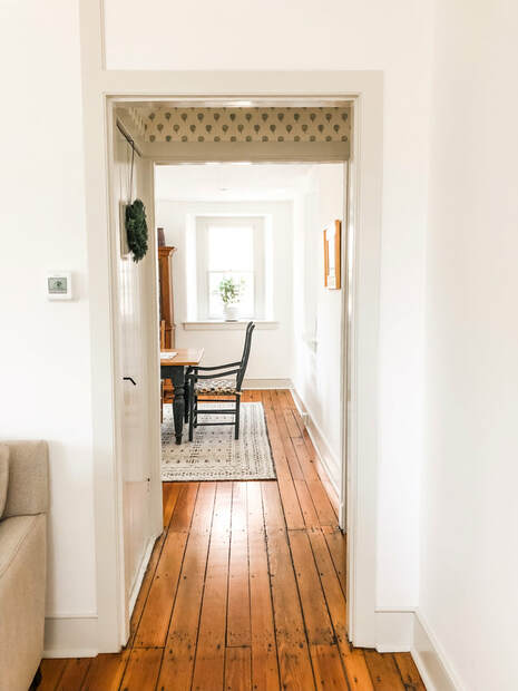
Our dining room celebrates the people and family history we love by incorporating the pieces passed down to us into the stories we are creating with our own family. There's a magic felt when you remember that the table you're gathering at was used for the same purpose by your departed loved ones, and it helps to tighten the thread that weaves our stories with their's. I hope you enjoyed hearing the stories woven around our dining room, and I look forward to sharing more tidbits with you from our quiet, Pennsylvanian Mill House. One of my dreams when buying an old house was that it would have an original fireplace. I had visions of a beautiful mantle or even one of those large, over sized brick fireplaces you find in kitchens with all the traditional kitchen tools. When we toured our home, there were no visible fireplaces, but the home had two chimneys. I remember naively remarking, "Well, maybe once we open up the walls, we'll find that traditional, 1874 fireplace." Looking back now, I realize that a grand living room fireplace just wasn't meant for a home that housed multiple working families. Our home is not a traditional 1874 colonial. The original 1874 structure has two identical rooms on each floor with a narrow staircase running up the middle. Those rooms housed millworkers who worked in the area. The purpose of this home was utilitarian. It was intentionally simple with no extra frills--and I honestly love that about our home. So when we opened up the walls and looked more closely at the basement, we came to realize that each of those separate rooms had a coal furnace instead of a fireplace. You can actually still see the circular imprint from the coal furnace on the original floors which adds such neat character to the home. While I was disappointed that my fireplace dreams were dashed, I realized that if I really wanted a fireplace, I could still have one installed that was keeping with the historical integrity of the home. After speaking with our contractor, we decided to flip the layout of the two rooms on the first floor used by our previous owners and use the old dining room as our living room so as to avoid the furnace when installing a gas fireplace. When approaching our renovation of the 1874 structure, we knew we wanted to accomplish two things: 1. We wanted to restore the original 1874 floors as best we could. 2. We wanted to add more natural light by adding two windows on the exterior wall. The floors on the first floor were in great shape. They just required a good sanding and new coat of polyurethane to make them beautiful again. As you can see from these two pictures taken before the renovation started, there were minimal windows in the home. Each of the identical rooms only had two windows, one on the front of the house and one on the back of the house. It just wasn't enough natural light for us, so we decided to add two windows to our living room, dining room, and master bedroom on the exterior wall that had no windows. We might have considered adding windows to our children's bedrooms, but the cost and labor involved prohibited us from doing that. The walls on the 1874 structure are THICK, stone walls. We're talking 20 inches of stone that had to be drilled through to create these new windows. Take a look at the mid-renovation picture below to see how extensive the process was, and then look at the more polished picture of the doorway between the living room and kitchen to really get a sense of how thick 20 inch stone walls really are! We made sure to mimic the deep sills that were a hallmark feature of homes built in the 1800s and existed in the original windows. In the midst of drilling holes through our walls, we discovered that the plasterwork over the stone walls needed serious restoration. We had a specialist come and really do a complete rework of the plaster in all of the rooms in the original structure. It was time consuming but completely worth it. Check out the suffering plasterwork and exposed ceilings in the picture below. I really wished we could have kept those exposed ceilings, because how beautiful is that wood?! Unfortunately it just wasn't practical as the day to day sounds would carry far too easily between the floorboards. When we decided to add the fireplace, we also wanted to add a set of built ins below the new windows that flanked both sides of the fireplace. We again worked with Village Handcrafted Cabinetry to create these built ins. As many of you know, storage is kind of like a unicorn in the world of old homes, and we were intentional and creative when trying to add useful storage throughout the house. Much like in the mudroom, whenever we put something "new" into our "old" home, we wanted it to seem like it was a part of the original structure. We accomplished that with the new fireplace and built ins by choosing historically accurate hardware and mantle. I think the final outcome is stunning. It provides the warmth and cozy feeling I craved while still maintaining the historical integrity of the home. When it came time to choose furniture for the space, we really benefitted from our interior designer, Kelly Robson of High Street Market, because the room lost a good deal of real estate due to the new built ins and fireplace. Every piece she chose worked beautifully in the modestly-sized room. We still have ample seating that truly fits the scale of the room. My favorite pieces from the room would be the light fixture and the ottoman. The ceilings in the 1874 structure of the home are low, so we didn't have too many opportunities to choose a light fixture that was not a flush mount style. This light fixture is a vintage surprise in the space. When it came to an ottoman for the room, I loved the fabric Kelly chose and its soft texture is perfect for our still toddling toddlers to avoid unnecessary bumps and bruises. As I close out this post, I'll leave you with a sneak peek of our next space: the dining room. I love this shot because it really captures the beauty of the original 1874 pine floors. Thanks for following along in our renovation adventures. As always, you can see more of our home on my instagram page or feel free to leave a comment--I'd love to hear from you!
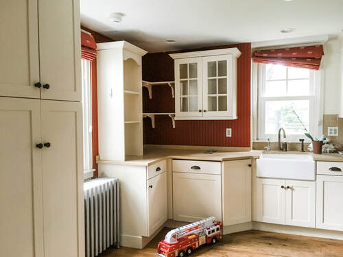
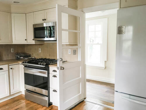
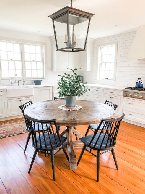
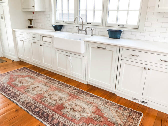
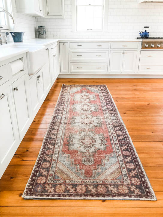
Growing up as a child, I remember sharing many moments with both my mom and dad baking Christmas cookies, peeling potatoes for Thanksgiving dinner, and learning how to make my all time favorite dessert, blonde brownies. The meals shared in my childhood kitchen always served as a touchstone for my mom, dad, brother, sister and I to reconnect after a busy day. Both my husband and I wanted to recreate this for our own children. When we first purchased our home, we knew that we wanted to update the kitchen. The kitchen had seen a lot of love over the years, and we wanted to create a space that would really function as the heart of the home. Once we took down the original addition, we expanded the foot print to really allow for a space where many people could gather at once. Whether it was just my intimate family of four or our large extended families, I wanted our kitchen to be the hub of activity. Before embarking on construction, we had a meeting of the minds with our architect (Warren Claytor of Warren Claytor Architects), builder (Pete McKenna of McKenna Building Group), and interior designer (Kelly Robson of High Street Market). Together, we designed our dream kitchen and got to work. If any of you have completed a kitchen demolition, you know that there are an endless amount of decisions to make from the color and style of cabinets to hardware and appliances. It can be extremely overwhelming. Thankfully, Kelly really listened to our ideas regarding style and aesthetic. It's no secret that white kitchens are a popular design. Whether we're in the kitchen, in the mudroom, or in a bedroom, I like a simple, edited, and clean design. To me, those attributes will always be timeless, so in thirty years, I hopefully won't feel like my home is dated. Here is a view of the finished result. To fully achieve our dream of a family-oriented space, we made the choice to ditch the traditional center island and put this beautiful farmhouse table in its place. When I look at this table, I see Sunday morning breakfast in our pajamas and family game nights filled with laughter. Sometimes it’s chaotic-but I wouldn’t have it any other way. If you love these choices, you should hightail it on over to Kelly's instagram and website to see more of her beautiful spaces and decor. Our table, chairs, lantern and rug are all from her shop. How beautiful is this vintage rug? It is completely reminiscent of the rug we chose for our mudroom which serves as a nice thread between the two spaces. When it came to our cabinetry, we worked with Village Handcrafted Cabinetry (the same business who completed our mudroom cabinetry). They were phenomenal. If you are looking for more of a small, independent business, they are the people for you. Full disclosure--my husband is the cook in the family, and he had very specific ideas regarding what type of cabinetry he wanted in the space. Village listened to all of his suggestions, and he could not be more pleased with the results.
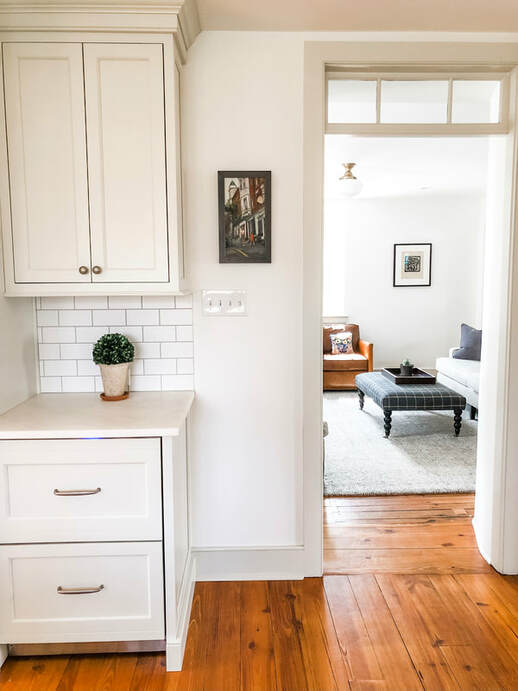
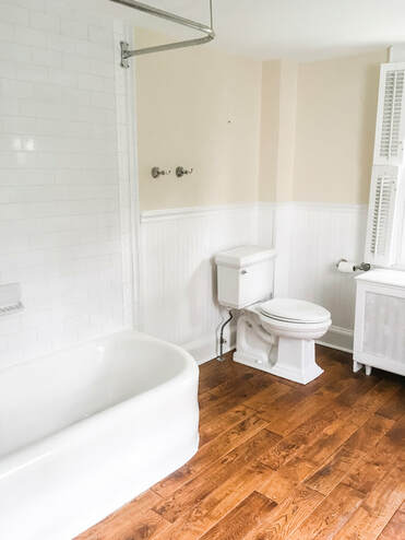
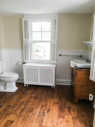
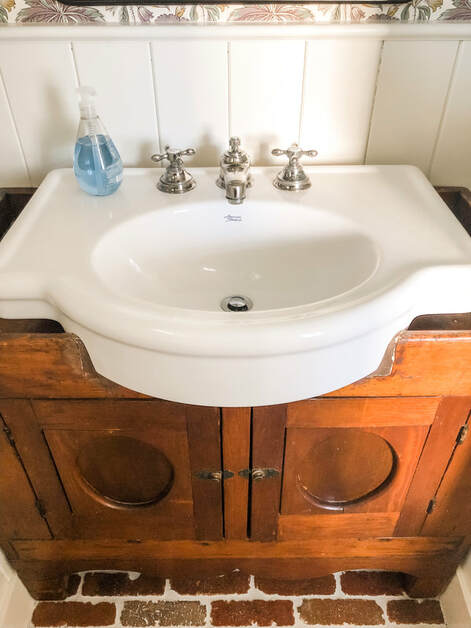
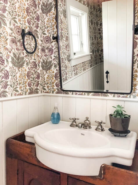
With that, I leave you with one final view of our kitchen which offers a sneak peek into our next space, the living room, which will be our first look at a room in the original 1874 structure of the home. You can see that we mimicked the transom we discovered off of the mudroom to create a cohesive look. Thanks for following along our journey, and I hope you enjoyed our kitchen renovation! When we first toured our home, we immediately fell in love with a space that many sensible people would disregard. One very important hiccup in the functionality of our home prior to the renovation was its one and only bathroom. As a soon to be family of four, we knew we could not function long term with one bathroom (on the second floor) in the entire house for a number of practical reasons. First, we knew we preferred to have a powder room somewhere on the first floor for our guests so that they (and we!) did not have to trudge upstairs every time we needed to use the bathroom. That being said, we loved a number of features from the original bathroom that we wanted to repurpose. Look below for pictures of the original bathroom. We wanted to repurpose both the tub (pictured left) and the vanity (pictured right). The tub was a beautiful, vintage bathtub that the previous owner said had been there forever. It needed a little TLC, but we eventually used it in our second floor kid's bathroom (pictures to come in a future post.). The sink, also vintage, was purchased separate from a stand so the previous owner found a wooden cabinet on which to fix the sink. The end result was a unique vanity that we knew we had to save. Thus, we repurposed it in our new, first floor powder room. It was important to us that we maintained our farmhouse aesthetic throughout our home, and this powder room reflects it perfectly. We carried the brick floors from the mudroom into the powder room which provides a utilitarian look that contrasts nicely with the more delicate and refined wallpaper. The wall paper itself continues the subtle use of purple I identified in the mudroom to really make it a cohesive space. I couldn't be happier with the finished product in this powder room, and I think it provides a welcoming and functional environment for our home.
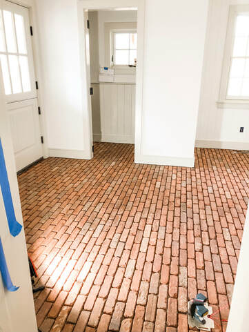
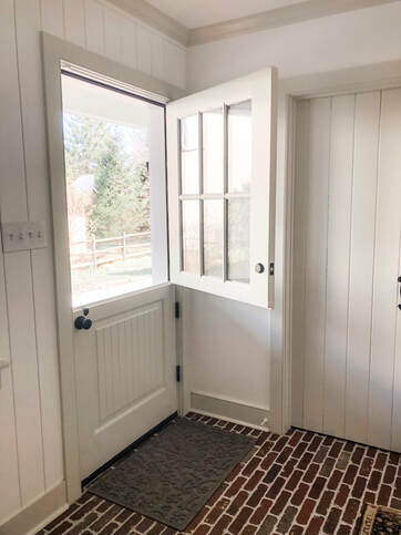
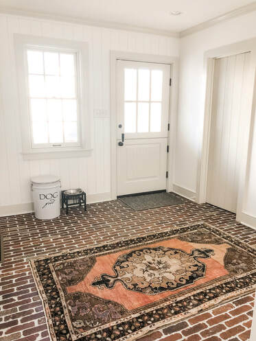
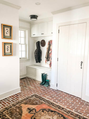
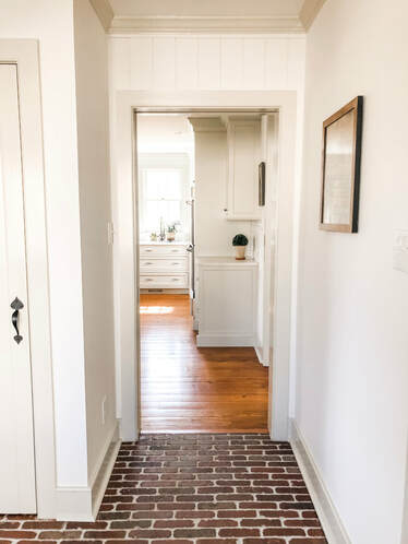
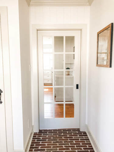
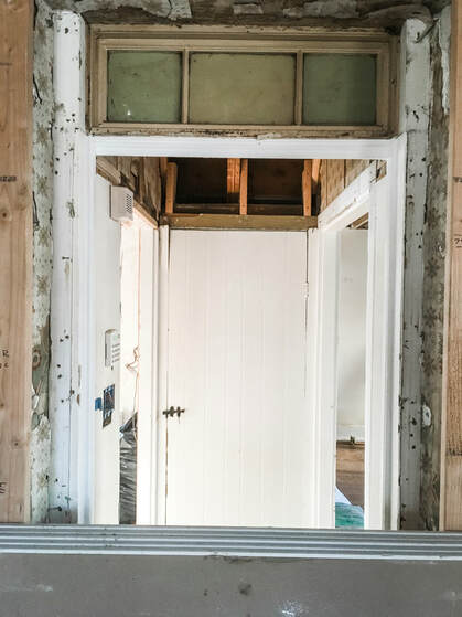
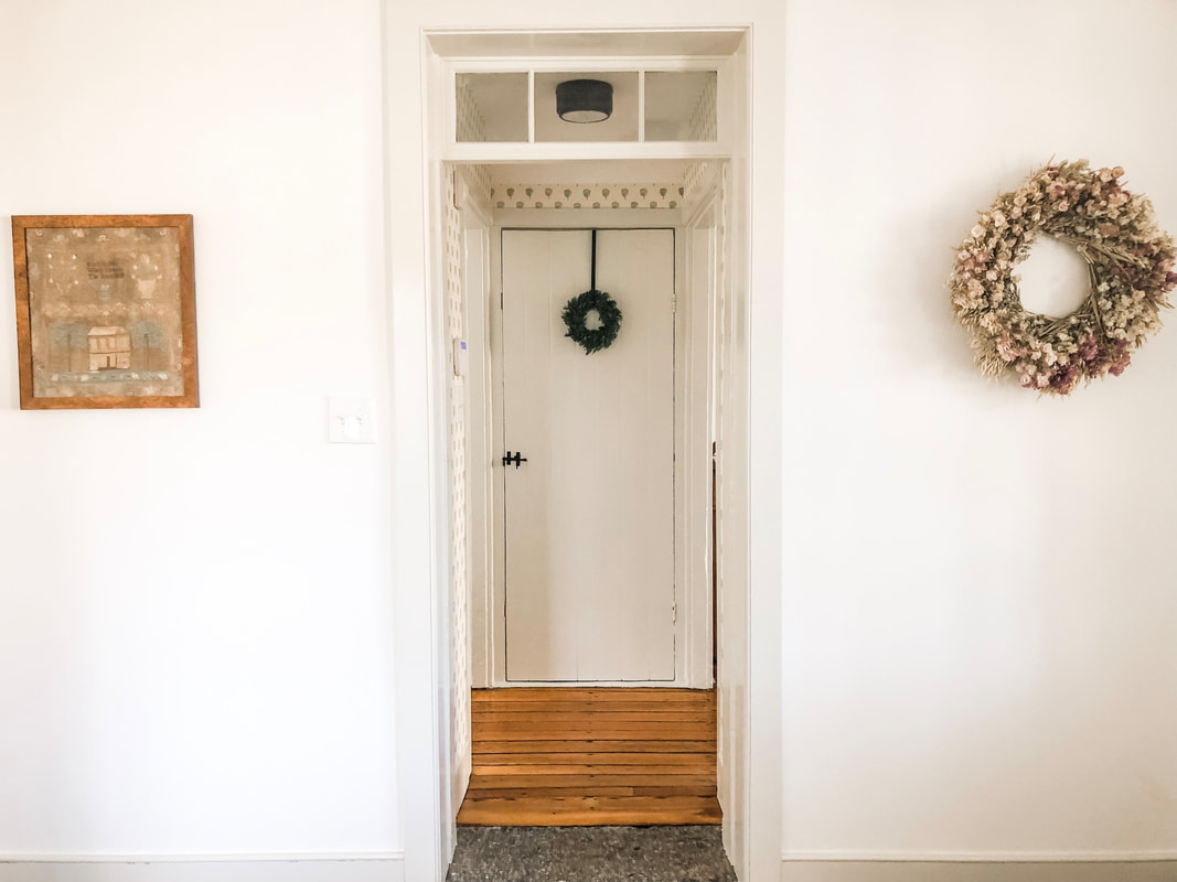
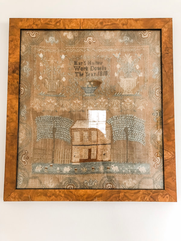
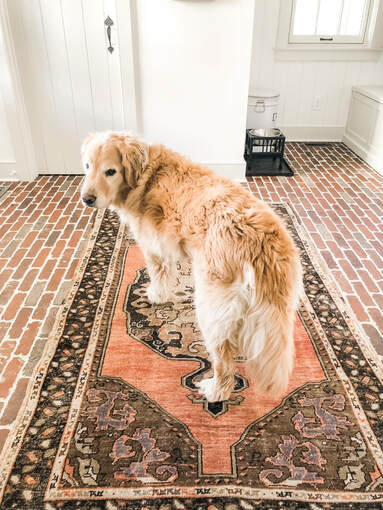
Here we go with the first round of before and afters: Mudroom Edition. As I mentioned in my previous post, we tore down the original addition to the 1874 structure and rebuilt one that was more usable for our family. That addition included my dream mudroom with Dutch door, brick floors, much needed storage space and a powder room for the first floor. The Dutch door leads to our new wrap around back porch which is ideal for the slow paced life of spring and summer. Brick floors were always a feature I coveted when I saw it in other homes. Its utilitarian aesthetic is perfect for a mudroom space and provides a pleasing and delightful break from the pine wood floors in the rest of the house. Above you can see a picture of it mid-installation. It was so intriguing to see the process unfold, and the dramatic results are incredible. Not to mention that dutch door! There's nothing better than opening the top half of your dutch door on a warm, spring day. How stunning is this vintage rug on top of that brick floor? Our interior designer, Kelly Robson from High Street Market, has a large quantity of vintage rugs that she sells in her store. I love the vibrant orange and subtle purple hues that play off the red tones in the brick. We found a beautiful wreath from Terrain that complements the subtle purples present in the rug. See picture below for a view of this wreath. We had custom cabinetry built and installed by Village Handcrafted Cabinetry. If you are familiar with old houses, you KNOW that there usually are not many closets, and if there are any, they are SMALL. Merion Millhouse had NO (and I mean NO) CLOSETS!! Storage was necessary in the mudroom for all of our coats, boots, and outdoor attire. With our finished mudroom, we now have storage in the custom bench, cabinets, and closet featured in the photo on the right. Just to the right of our cabinetry and coat closet, you get a sneak peek into our kitchen. We put in a pocket door with the idea of keeping the cold air out of the kitchen, but in actuality, we are currently using it to keep our toddler’s hands out of the dog’s water dish! I love to see the transition from brick to wood floors in these pictures. It's a visual reminder to the eye that you are now transitioning from outdoor to indoor space. The kitchen and the powder room are the other main spaces on the first floor of this addition. Stay tuned for future posts on those spaces. During construction of our addition, we found a nifty surprise when the crew was creating an opening between the mudroom and the 1874 part of the home. We found the original exterior door with 1800 transom above! It was like striking historic charm gold! Not only did we find the original door opening and transom, we unearthed the original stone step that would have served as the stoop leading to the outside. We also found layers upon layers of wallpaper from previous incarnations of the space. The patterns were incredible--take a look at the wallpaper swatches below and let me know your favorite! I think mine is the delicate rose pattern. Below is a picture of the renovated entry point with original 1800 transom. The interior door is the entrance to our basement and the first view you see of the 1874 part of the home. We chose a fun patterned wallpaper (more to come on this later) to dress up this little nook. The wreath on the right is the one I mentioned above that we purchased from Terrain. To the left is an 1818 stitched piece that my husband purchased from an antique store. I love the design, and it perfectly compliments our 1874 Millhouse. Plus, the frame matches the original 1874 pine floors you see in the old part of the house! How perfect is that? Check out a close up of the piece below. Alright, y'all, thank you so much for following along in our mudroom adventures. I'll sign off this post with a picture from the REAL owner of the space, our dog Tate, who was none too pleased that I moved his belongings around to take these pictures.
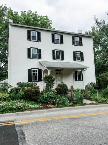
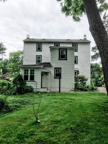
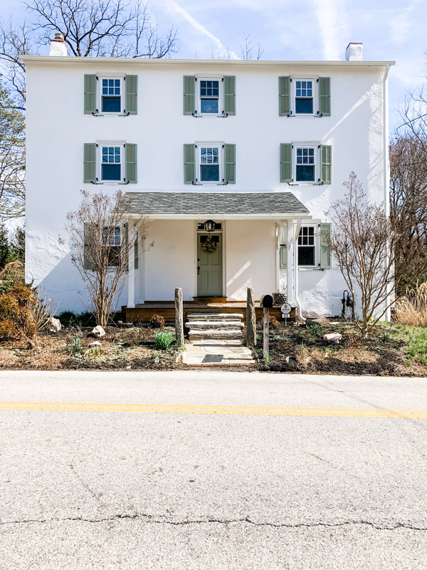
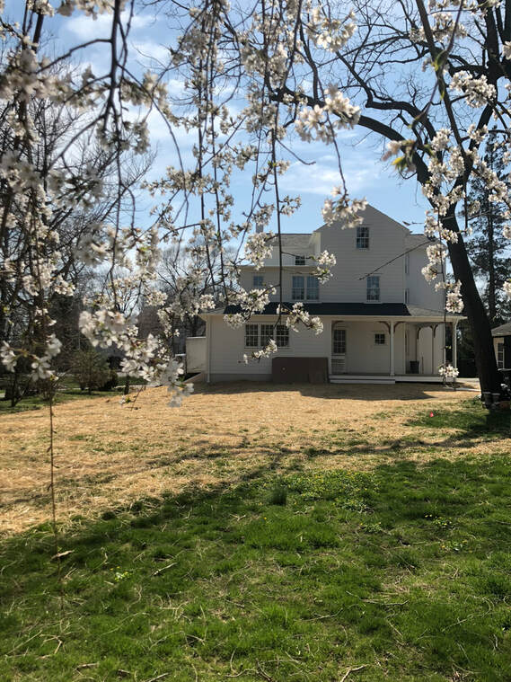
Welcome to Merion Mill House! Thank you so much for joining me as I navigate the joys of living and renovating a historic home. When renovating our home, we really wanted to preserve the historic charm while maintaining a clean, simplistic style. We had such an immense amount of help from our interior designer, Kelly Robson from High Street Market, to help achieve this aesthetic. I hope this is a place where you can share my appreciation for blending the historic with the modern. Here is a picture of what our house looked like when we bought it. The family who owned it before us lived there for thirty years and raised two boys. One of those boys happened to go to high school with my husband. These small world connections made it even more special to purchase this house. In the second picture, you can see the original addition that was added on to the 1874 structure. The 1874 part has six identical rooms (two on each floor) and no kitchen or bathroom. A center staircase separates the two rooms on each floor. This is still the current layout today. As we began our renovation plans, we decided not to change the layout. We were purposeful in maintaining the old part of the house as our main living spaces. Therefore the six rooms in the original structure serve as our living room, dining room, and bedrooms. We love old houses and wanted to live in those spaces. Our neighbors, who live in the sister house next door, told us that the original rooms were thought to be “apartments” for the millworkers in the 1800s. Over the years, the various owners added a kitchen and one bathroom on the second floor. If any of you have ever decided to renovate a historic home, a home that is on the historic registry, you know the logistical hoops you go through to make any changes. We went through all that and more. When addressing any changes to the exterior of the historic facade, we ran everything by the board of the historical society. We sat patiently through multiple hearings about historically accurate windows, shutters, and anything else that might compromise the historical integrity of the house. Luckily, changing the paint color of the shutters was no big deal. I personally didn't like the harsh contrast of the black shutters on the white plaster. We chose a softer green that reminds me of cottages in the English country side. Originally we thought we would keep the existing addition and just renovate on the inside. However, foundation issues with the addition made it more practical for us to tear down the addition and start new. This gave us a lot more freedom than working within the existing blueprint. This addition includes a mudroom, powder bath, and kitchen on the first floor. A hall bathroom, master closets, and master bath on the second floor. Lastly, there is a shared hall bathroom on the third floor. For our young family, only having one bathroom on the second floor was impractical. We wanted each bedroom space to have an easily accessible bathroom. We also added that amazing back porch!
Down the road we want to add some patio spaces, but that will be some time in the future. We could not have done this wonderful addition with out the tremendous vision of our architect, Warren Claytor of Warren Claytor Architects, and our builder, Pete McKenna of McKenna Building Group. Well, I hope you enjoyed my little introduction to our renovation of Merion Millhouse, and stay tuned for future posts of the renovated interior! If you like what you see, go on over to Instagram and follow me at @merionmillhouse. |
Archives
May 2019
Categories |

 RSS Feed
