|
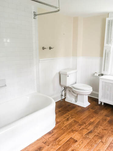
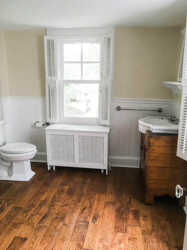
When we first toured our home, we immediately fell in love with a space that many sensible people would disregard. One very important hiccup in the functionality of our home prior to the renovation was its one and only bathroom. As a soon to be family of four, we knew we could not function long term with one bathroom (on the second floor) in the entire house for a number of practical reasons. First, we knew we preferred to have a powder room somewhere on the first floor for our guests so that they (and we!) did not have to trudge upstairs every time we needed to use the bathroom. That being said, we loved a number of features from the original bathroom that we wanted to repurpose. Look below for pictures of the original bathroom.
We wanted to repurpose both the tub (pictured left) and the vanity (pictured right). The tub was a beautiful, vintage bathtub that the previous owner said had been there forever. It needed a little TLC, but we eventually used it in our second floor kid's bathroom (pictures to come in a future post.). The sink, also vintage, was purchased separate from a stand so the previous owner found a wooden cabinet on which to fix the sink. The end result was a unique vanity that we knew we had to save. Thus, we repurposed it in our new, first floor powder room. 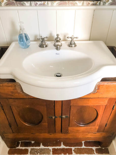 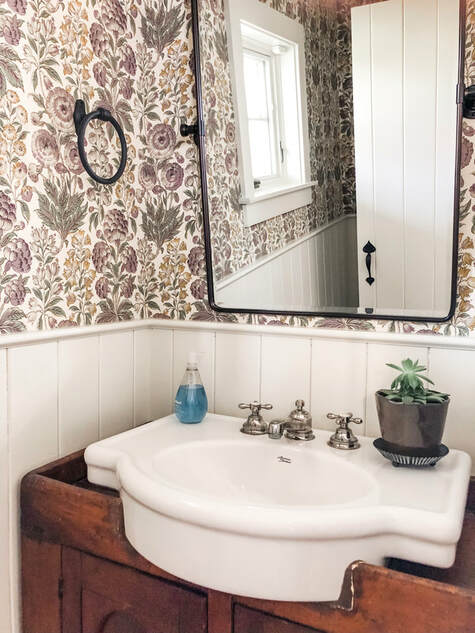 It was important to us that we maintained our farmhouse aesthetic throughout our home, and this powder room reflects it perfectly. We carried the brick floors from the mudroom into the powder room which provides a utilitarian look that contrasts nicely with the more delicate and refined wallpaper. The wall paper itself continues the subtle use of purple I identified in the mudroom to really make it a cohesive space. I couldn't be happier with the finished product in this powder room, and I think it provides a welcoming and functional environment for our home.
2 Comments
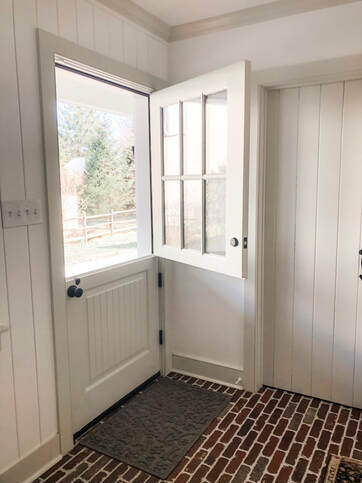
Here we go with the first round of before and afters: Mudroom Edition. As I mentioned in my previous post, we tore down the original addition to the 1874 structure and rebuilt one that was more usable for our family. That addition included my dream mudroom with Dutch door, brick floors, much needed storage space and a powder room for the first floor. The Dutch door leads to our new wrap around back porch which is ideal for the slow paced life of spring and summer.
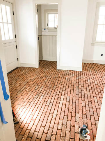
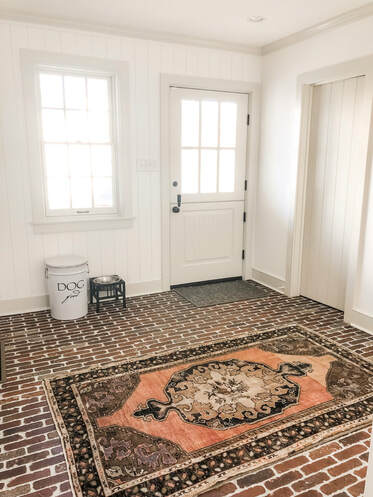
Brick floors were always a feature I coveted when I saw it in other homes. Its utilitarian aesthetic is perfect for a mudroom space and provides a pleasing and delightful break from the pine wood floors in the rest of the house. Above you can see a picture of it mid-installation. It was so intriguing to see the process unfold, and the dramatic results are incredible. Not to mention that dutch door! There's nothing better than opening the top half of your dutch door on a warm, spring day.
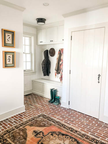
How stunning is this vintage rug on top of that brick floor? Our interior designer, Kelly Robson from High Street Market, has a large quantity of vintage rugs that she sells in her store. I love the vibrant orange and subtle purple hues that play off the red tones in the brick. We found a beautiful wreath from Terrain that complements the subtle purples present in the rug. See picture below for a view of this wreath. We had custom cabinetry built and installed by Village Handcrafted Cabinetry. If you are familiar with old houses, you KNOW that there usually are not many closets, and if there are any, they are SMALL. Merion Millhouse had NO (and I mean NO) CLOSETS!! Storage was necessary in the mudroom for all of our coats, boots, and outdoor attire. With our finished mudroom, we now have storage in the custom bench, cabinets, and closet featured in the photo on the right.
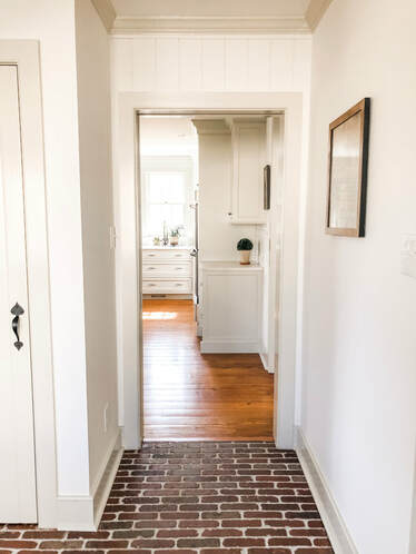
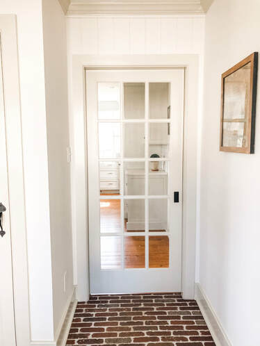
Just to the right of our cabinetry and coat closet, you get a sneak peek into our kitchen. We put in a pocket door with the idea of keeping the cold air out of the kitchen, but in actuality, we are currently using it to keep our toddler’s hands out of the dog’s water dish! I love to see the transition from brick to wood floors in these pictures. It's a visual reminder to the eye that you are now transitioning from outdoor to indoor space. The kitchen and the powder room are the other main spaces on the first floor of this addition. Stay tuned for future posts on those spaces. 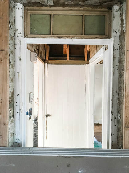 During construction of our addition, we found a nifty surprise when the crew was creating an opening between the mudroom and the 1874 part of the home. We found the original exterior door with 1800 transom above! It was like striking historic charm gold! Not only did we find the original door opening and transom, we unearthed the original stone step that would have served as the stoop leading to the outside. We also found layers upon layers of wallpaper from previous incarnations of the space. The patterns were incredible--take a look at the wallpaper swatches below and let me know your favorite! I think mine is the delicate rose pattern. Below is a picture of the renovated entry point with original 1800 transom. The interior door is the entrance to our basement and the first view you see of the 1874 part of the home. We chose a fun patterned wallpaper (more to come on this later) to dress up this little nook. The wreath on the right is the one I mentioned above that we purchased from Terrain. To the left is an 1818 stitched piece that my husband purchased from an antique store. I love the design, and it perfectly compliments our 1874 Millhouse. Plus, the frame matches the original 1874 pine floors you see in the old part of the house! How perfect is that? Check out a close up of the piece below. 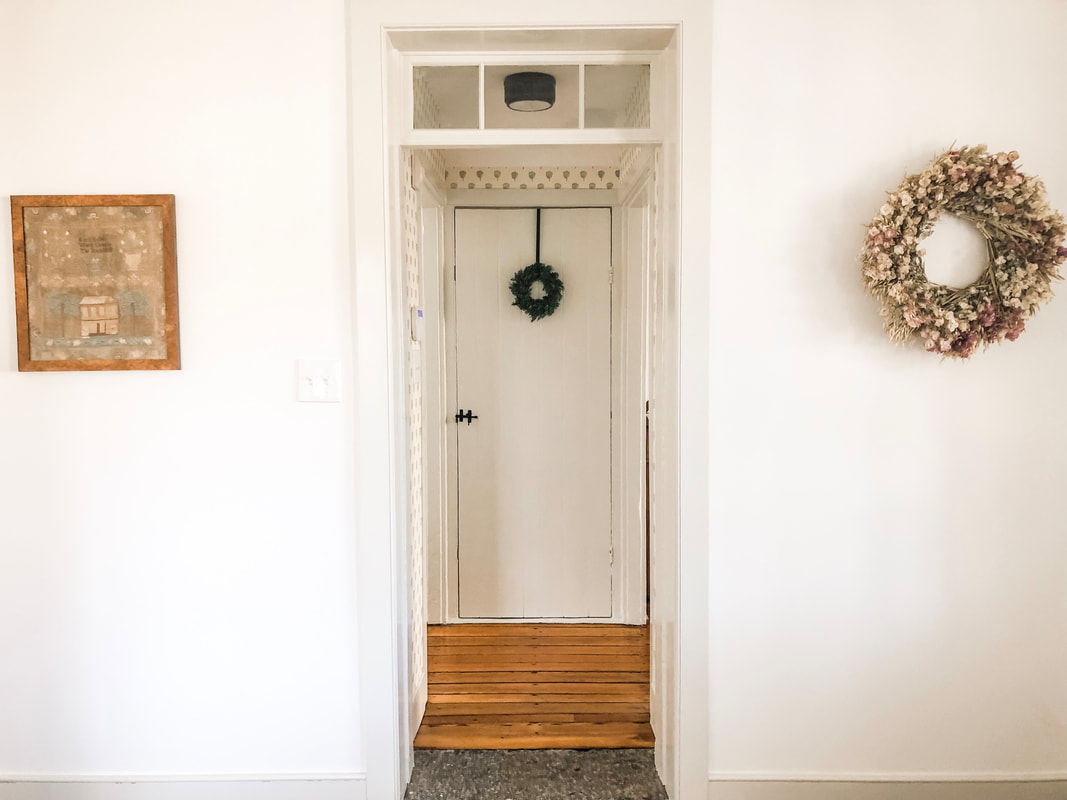 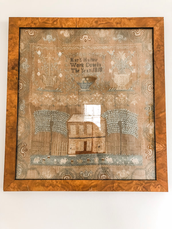 Alright, y'all, thank you so much for following along in our mudroom adventures. I'll sign off this post with a picture from the REAL owner of the space, our dog Tate, who was none too pleased that I moved his belongings around to take these pictures. 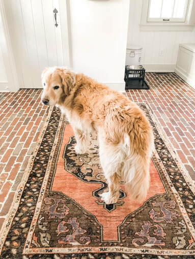 Welcome to Merion Mill House! Thank you so much for joining me as I navigate the joys of living and renovating a historic home. When renovating our home, we really wanted to preserve the historic charm while maintaining a clean, simplistic style. We had such an immense amount of help from our interior designer, Kelly Robson from High Street Market, to help achieve this aesthetic. I hope this is a place where you can share my appreciation for blending the historic with the modern.
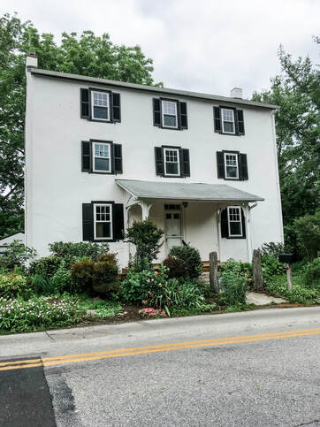
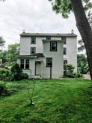
Here is a picture of what our house looked like when we bought it. The family who owned it before us lived there for thirty years and raised two boys. One of those boys happened to go to high school with my husband. These small world connections made it even more special to purchase this house. In the second picture, you can see the original addition that was added on to the 1874 structure. The 1874 part has six identical rooms (two on each floor) and no kitchen or bathroom. A center staircase separates the two rooms on each floor. This is still the current layout today. As we began our renovation plans, we decided not to change the layout. We were purposeful in maintaining the old part of the house as our main living spaces. Therefore the six rooms in the original structure serve as our living room, dining room, and bedrooms. We love old houses and wanted to live in those spaces. Our neighbors, who live in the sister house next door, told us that the original rooms were thought to be “apartments” for the millworkers in the 1800s. Over the years, the various owners added a kitchen and one bathroom on the second floor. 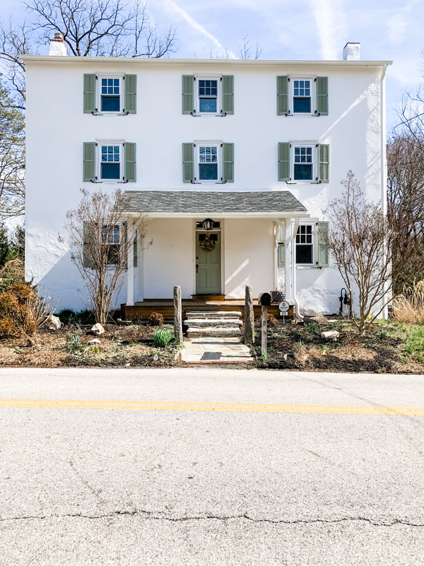 If any of you have ever decided to renovate a historic home, a home that is on the historic registry, you know the logistical hoops you go through to make any changes. We went through all that and more. When addressing any changes to the exterior of the historic facade, we ran everything by the board of the historical society. We sat patiently through multiple hearings about historically accurate windows, shutters, and anything else that might compromise the historical integrity of the house. Luckily, changing the paint color of the shutters was no big deal. I personally didn't like the harsh contrast of the black shutters on the white plaster. We chose a softer green that reminds me of cottages in the English country side. 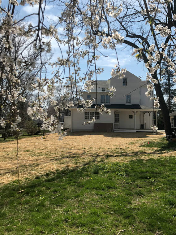 Originally we thought we would keep the existing addition and just renovate on the inside. However, foundation issues with the addition made it more practical for us to tear down the addition and start new. This gave us a lot more freedom than working within the existing blueprint. This addition includes a mudroom, powder bath, and kitchen on the first floor. A hall bathroom, master closets, and master bath on the second floor. Lastly, there is a shared hall bathroom on the third floor. For our young family, only having one bathroom on the second floor was impractical. We wanted each bedroom space to have an easily accessible bathroom. We also added that amazing back porch!
Down the road we want to add some patio spaces, but that will be some time in the future. We could not have done this wonderful addition with out the tremendous vision of our architect, Warren Claytor of Warren Claytor Architects, and our builder, Pete McKenna of McKenna Building Group. Well, I hope you enjoyed my little introduction to our renovation of Merion Millhouse, and stay tuned for future posts of the renovated interior! If you like what you see, go on over to Instagram and follow me at @merionmillhouse. |
Archives
May 2019
Categories |
 RSS Feed
